Maps of NYPD Stops, 2011
Lee Hachadoorian on Dec 2nd 2013

The Bronx is heavily Black and Latino, and shows a high number of NYPD stops over much of the borough.
There have been a lot of ups and downs in the battle over the NYPD Stop and Frisk program. Over the Summer, a federal judge ruled the program unconstitutional as practiced, and appointed a federal monitor to oversee reforms. Then, a month ago, a federal appeals panel removed Judge Scheindlin from the case, and put a stay on her orders. Bill de Blasio was elected mayor promising to drop the City’s appeal, but lame duck Mayor Bloomberg tried to push the appeal to a full overturning of Judge Scheindlin’s ruling before leaving office. Now the full Second Circuit has put on hold any further action while the litigants negotiate—clearly taking the ball from Bloomberg and passing it to the mayor-elect.
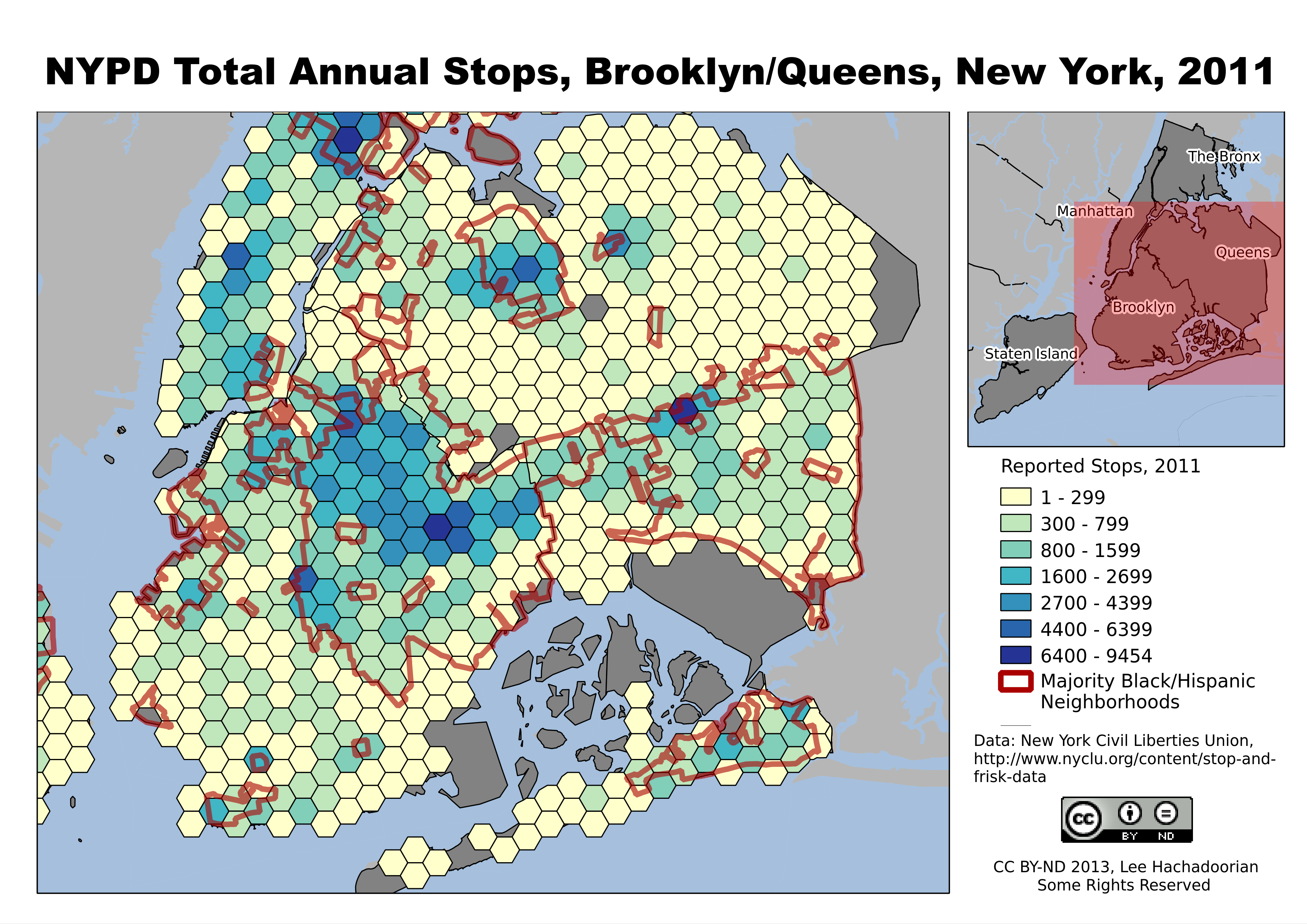
Stops are concentrated in predominantly Black and Latino neighborhoods like Bedford-Stuyvesant and East New York in Brooklyn, and East Elmhurst and Jamaica in Queens.
Much of the focus in the case has been on whether the Stop and Frisk program was implemented in a racially biased manner, with considerable concern over the targeting of young Blacks and Latinos. The maps I’ve created, based on the 2011 statistics, do show many more stops taking place in predominantly Black and Latino neighborhoods. The maps do not show the race of the people being stopped, an important consideration in the trial, as plaintiffs presented evidence that the “hit rate”—stops that actually led to the discovery of a crime—was much lower for Black and Latinos than for Whites, indicating that the police were using a different, and looser, standard for what they regarded as suspicious behavior by Blacks and Latinos.
The main exception to the correlation between neighborhood demographics and volume of police stops is in Manhattan. We do see a concentration of stops in the Black and Latino neighborhoods of Harlem and Washington Heights, but we also see generally higher stops in Manhattan than in the outer boroughs. Doubtless this is due to Manhattan’s generally higher nonresidential population (commuters, shoppers, etc.), as well as the generally higher pedestrian counts in Lower Manhattan and Midtown.
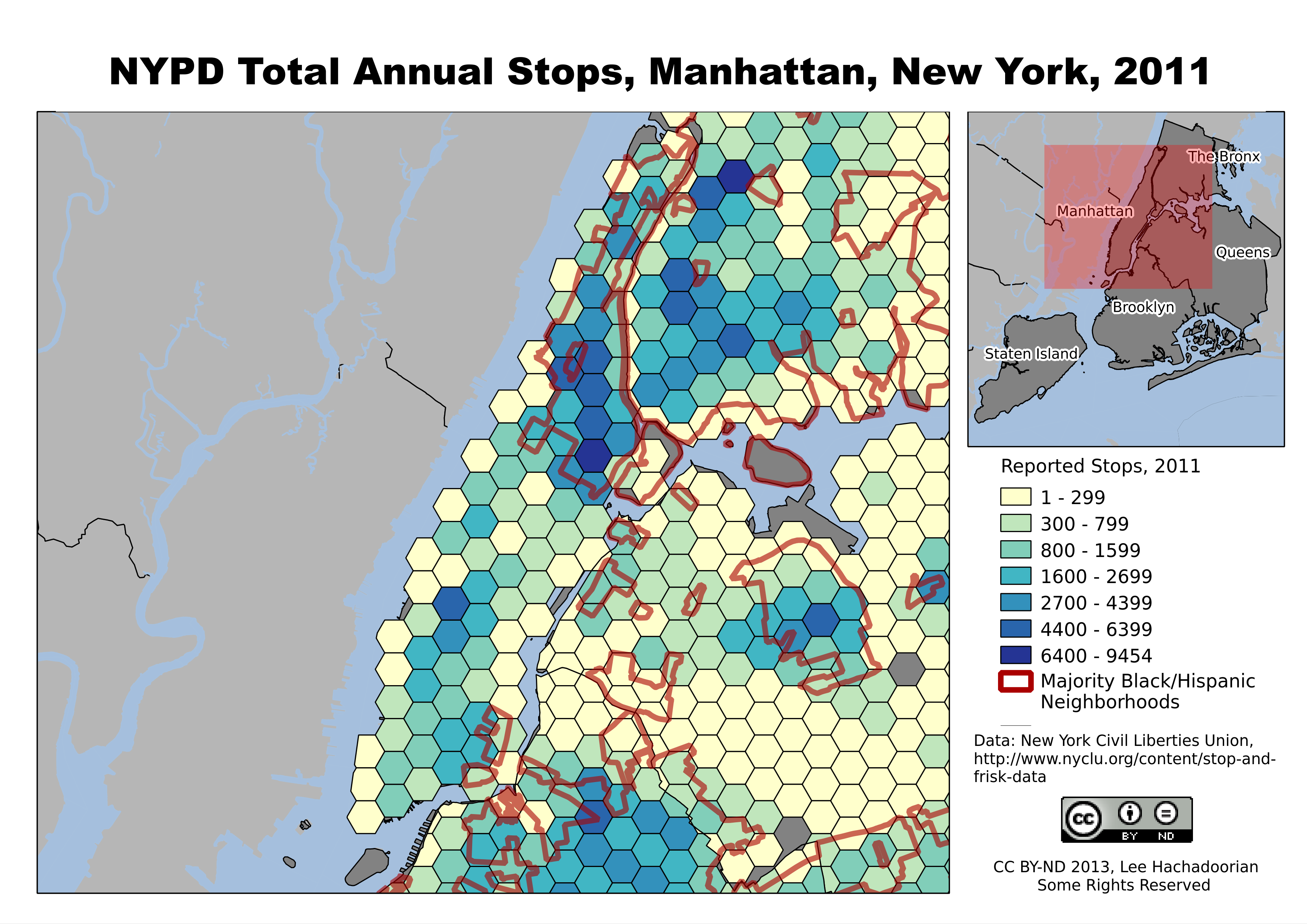
Manhattan, with its high daily influx of nonresidents for employment, shopping, and commercial activities, has high numbers of NYPD stops throughout the borough.
While the differences in “hit rate” helped Judge Scheindlin conclude that this policy led to “indirect racial profiling”, the ridiculously low yield—less than 12% of stops led to a summons or arrest in 2011 (about equally split)—suggests that the police are extremely poor judges of suspicious behavior. But what do you expect of a policy that allows the police to stop someone for “inappropriate attire for season” (about 7.5% of stops in 2011)?
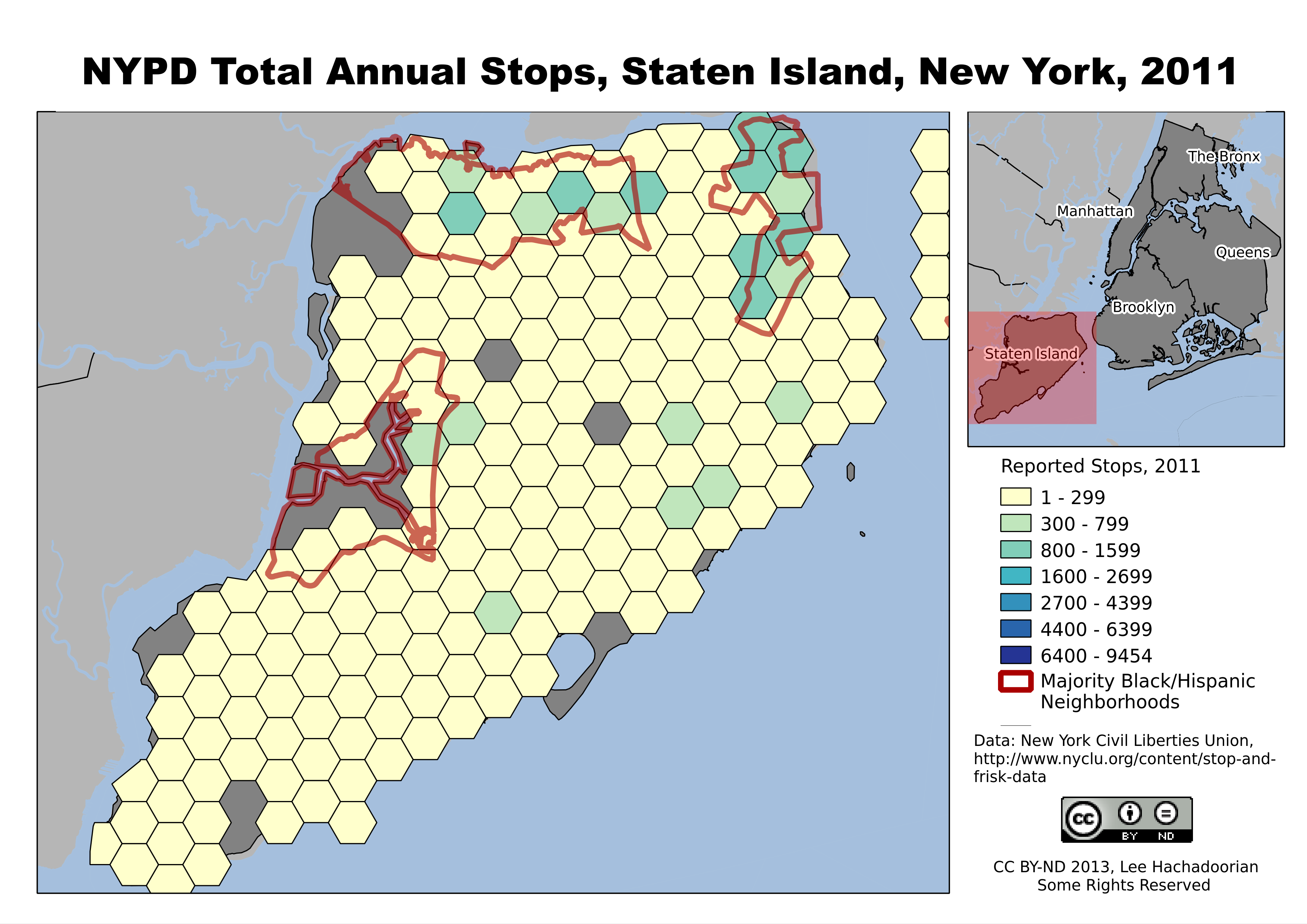
Staten Island’s population is more White, and subject to fewer police stops.
Filed in GIS,Governance | One response so far
One Response to “Maps of NYPD Stops, 2011”
[…] Final versions of the maps are available at my Free City blog. […]